LinkedIn Banner Design Guide: How to Create a Conversion-Focused Background
If you're wondering what LinkedIn banner size to use in 2026 and how to make it actually help your profile branding, here's the short answer: use 1584 × 396 px for a personal profile banner, keep your main message in the center-safe area, and design for clarity before decoration. A good banner should support your positioning in a few seconds, not act like a busy poster.
If you want to turn that process into a repeatable LinkedIn workflow, you can explore how Dynal works as an AI LinkedIn agent here: Dynal. It’s a helpful place to see the full discover → analyze → generate → publish flow in context.
Key takeaways
- LinkedIn banner size 2026 for personal profiles: 1584 × 396 px.
- Your banner should reinforce who you help, what you do, and why you're relevant.
- Put important text away from the profile photo overlap and edge crops.
- Design for both desktop and mobile, with the center area doing most of the work.
- If you want a faster starting point, Dynal's Free Tool: LinkedIn Banner Generator is built for LinkedIn-specific banner creation with safe-zone-aware layouts.
What is the LinkedIn banner size in 2026?
For personal LinkedIn profiles, the recommended banner size in 2026 is:
- 1584 × 396 px
Other LinkedIn banner dimensions you may see include:
- Company page banner: 1128 × 191 px
- Event banner: 1776 × 444 px
If you're optimizing your personal profile branding, the main dimension to remember is 1584 × 396 px.
Why this size matters
Using the correct dimensions helps you avoid:
- blurry exports
- stretched images
- cut-off text
- awkward empty space on wider screens
But size alone is not enough. The real performance difference comes from layout.
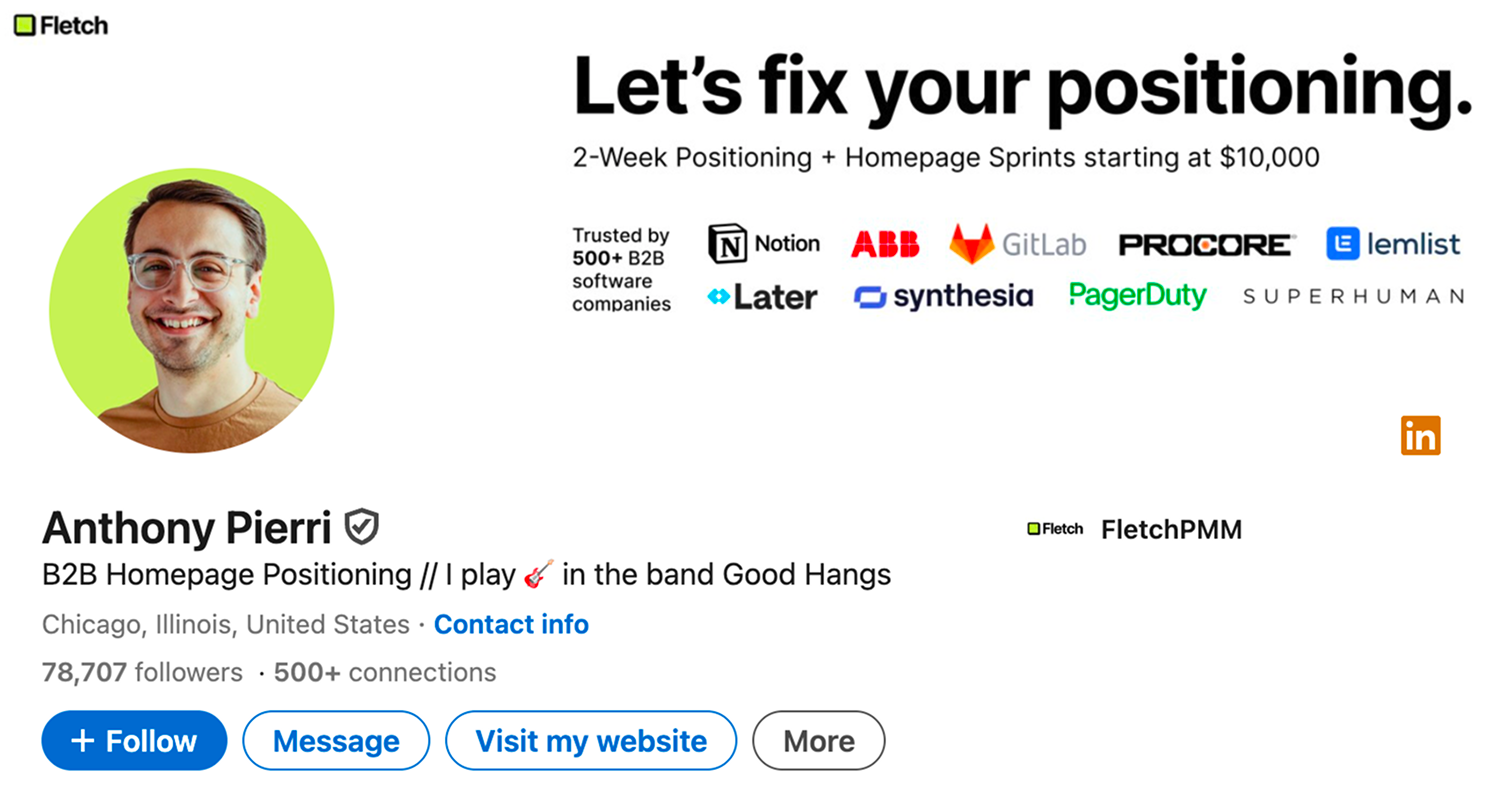
Notice how Anthony Pierri keeps his primary "Let's fix your positioning" message in the top right, completely clear of the profile photo overlap on the left
What makes a LinkedIn banner conversion-focused?
A conversion-focused LinkedIn banner does one job well: it helps a visitor understand your professional positioning fast enough to take the next step.
On LinkedIn, that next step is usually one of these:
- sending a connection request
- clicking through to your featured section or website
- reading your profile more closely
- deciding you're credible enough to message
That means your banner should support your profile branding by answering at least one of these questions immediately:
- What do you do?
- Who do you help?
- What topic are you known for?
- What makes your positioning distinct?
What should you put on your LinkedIn banner to convert visitors?
The best banner content depends on your role, but most high-performing banners include a combination of these elements.
1. A clear positioning statement
This is the fastest way to make your profile easier to understand.
Examples:
- "Helping B2B founders turn expertise into inbound demand"
- "LinkedIn content strategy for coaches and consultants"
- "I build AI workflows for lean go-to-market teams"
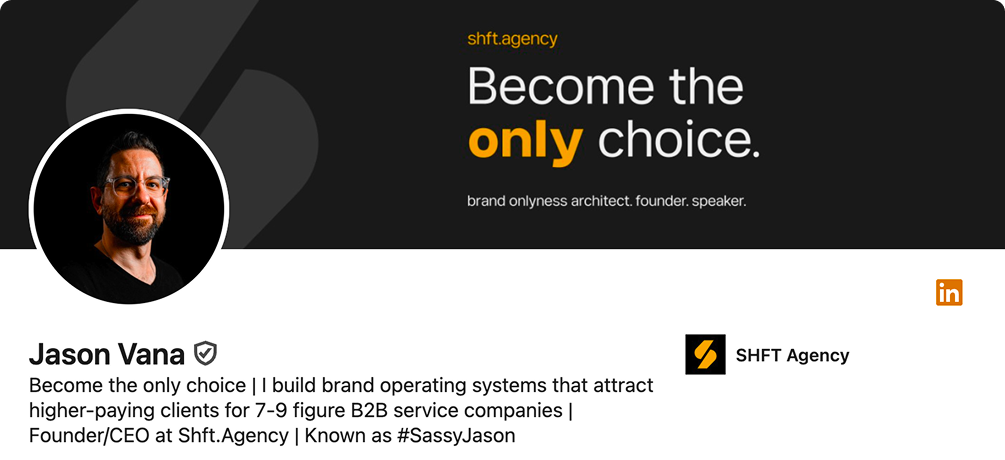
Jason Vana uses high-contrast typography to highlight his core value proposition: "Become the only choice."
Keep it short. One strong line beats three vague ones.
2. A visual cue tied to your niche
This could be:
- your brand colors
- a subtle industry-related background
- simple shapes or gradients
- a clean visual system that matches your profile photo and headline
The goal is recognition, not decoration.
3. Optional proof or specificity
If relevant, add one credibility cue such as:
- a niche descriptor
- a short tagline
- a concise proof point
- a soft CTA like "Open to partnerships" or "Weekly insights on AI + LinkedIn"
For highly specialized niches, data-driven proof points can build instant trust before a visitor even scrolls down
Avoid turning the banner into a résumé. Your headline and About section already do that work.
4. Message-to-profile alignment
Your banner should match the rest of your profile branding:
- profile headline says what you do now
- banner visually reinforces that positioning
- About section expands the story
- featured section captures intent
When these pieces align, your profile feels more credible and easier to trust.
How do I design a LinkedIn banner that improves profile branding?
Use this simple framework:
The 5-part banner framework
1. Start with one message
Pick the single idea you want someone to remember.
Good examples:
- your niche
- your value proposition
- your category
- your content theme
Bad examples:
- listing every service
- using tiny text blocks
- mixing multiple offers
- adding random buzzwords with no hierarchy
2. Choose a layout based on profile photo overlap
On LinkedIn, your profile photo covers part of the banner area. That means placement matters.
A practical rule:
- keep dense text and logos away from the area behind the profile photo
- use whitespace intentionally
- let the center and upper-middle area carry the main message
Common layout options that work well:
- Left space for photo: useful when the profile image overlaps heavily on one side
- Centered message: best for creators and personal brands
- Right accent layout: useful when you want a clean text block with supporting visual balance
- Minimal gradient: good when your headline already carries most of the positioning
3. Design for readability first
Use strong contrast between text and background.
Checklist:
- dark text on light background, or light text on dark background
- no busy photography behind small copy
- large enough font size for mobile visibility
- one primary focal point
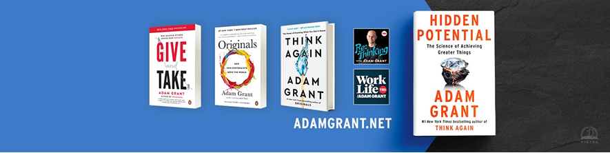
Adam Grant uses a simple blue background to make his book titles pop, ensuring readability even on smaller screens.
If someone can only glance at your banner for a few seconds, readability wins.
4. Keep the center area important
Desktop and mobile display your banner differently. The safest move is to keep the most important content in the center portion of the canvas.
As a rule of thumb:
- treat the center 60% as the most dependable area
- avoid placing critical text near far edges
- don't place important details too low
This reduces the risk of awkward cropping across devices.
5. Match your banner to your actual positioning
A banner only works if it reflects the role you want to be known for.
For example:
- a consultant should emphasize outcome + audience
- a creator should emphasize topic + identity
- a service business should emphasize offer + trust cue
- a job seeker should emphasize direction + professionalism
How do I make my LinkedIn banner look good on desktop and mobile?
This is where most banners fail.
A banner can look polished on a laptop and still break on mobile if the text is too wide, too low, or too close to the edge.
Mobile-friendly banner rules
Use fewer words
Aim for:
- 5 to 12 words for your main line
- one supporting line at most
Keep key content centered
Don't rely on edge placement for essential text.
Avoid tiny logos and fine details
Thin lines, small icons, and dense screenshots often disappear on smaller screens.
Test crops before publishing
Preview your design at:
- full desktop width
- narrower mobile crop
- reduced size thumbnail view
If your message still reads clearly, you're in good shape.
What is the best LinkedIn banner layout for creators and service businesses?
The best layout depends on the conversion goal.
Best layout for creators
Creators usually benefit from a banner that highlights:
- topic authority
- content theme
- recognizable personal brand
Best layout: centered or slightly offset headline with clean background
What to include:
- your topic niche
- a short descriptor
- consistent brand colors or style
Example:
Sharing practical insights on B2B growth, LinkedIn, and AI workflows
Why it works: it tells visitors what kind of content to expect.
Best layout for service businesses
Service providers usually need a stronger value proposition.
Best layout: clear headline plus one proof or audience cue, with open space around the profile photo area
What to include:
- who you help
- what outcome you deliver
- optional credibility cue
Example:
We help SaaS teams turn product expertise into LinkedIn demand generation
Why it works: it connects service + audience + business outcome.
Step-by-step: how to create a conversion-focused LinkedIn banner
Step 1: Define the profile goal
Choose one primary goal:
- attract leads
- earn speaking or partnership interest
- grow creator authority
- support a job search
- strengthen profile branding for networking
Your banner should support that goal, not try to do all of them at once.
Step 2: Write your banner message
Use one of these simple templates.
Template A: Audience + outcome
"Helping [audience] achieve [outcome]"
Example:
"Helping consultants turn LinkedIn into a trust-building channel"
Template B: What I do + niche
"[What I do] for [niche]"
Example:
"Content strategy for B2B founders"
Template C: Topic-led creator brand
"Insights on [topic 1], [topic 2], and [topic 3]"
Example:
"Insights on LinkedIn growth, brand positioning, and AI workflows"
Step 3: Choose a layout
Pick based on your message type:
- short, bold message: centered
- longer value proposition: side-aligned with whitespace
- highly visual personal brand: minimal text with stronger design identity
Step 4: Build the banner at the right size
Create your file at 1584 × 396 px.
If you want a faster workflow, Dynal's Free Tool: LinkedIn Banner Generator supports LinkedIn banner creation with:
- personal, company, and event sizes
- multiple themes and layouts
- safe-zone-aware design guidance
- optional image transform flow
It's a useful starting point if you want to generate a cleaner banner before refining your broader LinkedIn presence.
Step 5: Check for safe zones and crop risk
Before exporting, ask:
- Is any key text behind the profile photo area?
- Is the message readable at a glance?
- Does the design still work if the edges are cropped?
- Is there too much visual clutter?
Step 6: Match the banner to the rest of the profile
Review your:
- profile photo
- headline
- About section
- featured links
If the banner promises one thing but the headline says another, profile branding weakens.
LinkedIn banner checklist
Use this before uploading.
- Banner size is 1584 × 396 px
- Main message is clear in under 3 seconds
- Important content is kept in the center-safe area
- No critical text sits behind the profile photo overlap
- Colors match your profile branding
- Font size is readable on mobile
- Visual style supports your professional positioning
- Banner aligns with your headline and About section
- There is one main idea, not five competing ones
- File is exported cleanly and looks sharp on upload
Common LinkedIn banner mistakes — and how to fix them
Mistake 1: Treating the banner like an ad
Problem: too many claims, icons, logos, and CTAs.
Fix: reduce it to one message and one supporting visual cue.
Mistake 2: Designing only for desktop
Problem: text gets cropped or becomes unreadable on mobile.
Fix: keep important content central and shorten copy.
Mistake 3: Repeating the exact headline word-for-word
Problem: wasted space.
Fix: let the banner complement your headline instead of duplicating it.
Mistake 4: Using generic stock imagery with no positioning
Problem: looks polished but says nothing.
Fix: add a clear statement, niche cue, or branded visual direction.
Mistake 5: Over-designing
Problem: gradients, shapes, photos, and text all compete.
Fix: choose one focal point and simplify the rest.
Example banner directions by profile type
For consultants
Banner line:
Helping B2B teams clarify positioning and create better LinkedIn content
Design direction:
minimal background, one accent color, left or center text block
For coaches
Banner line:
Career clarity and personal branding for operators moving into leadership
Design direction:
clean and warm, readable typography, subtle trust-building visual style
For founders
Banner line:
Building practical AI systems for modern revenue teams
Design direction:
bold but minimal, modern tech palette, short headline
For creators
Banner line:
Weekly insights on LinkedIn strategy, profile branding, and authority building
Design direction:
centered message, simple graphic identity, low clutter
Should you put text on a LinkedIn banner?
Usually, yes — but only if the text is short and useful.
Text works well when it adds:
- positioning
- topic clarity
- relevance
- memorability
Skip text if:
- your design is already too busy
- you can't make it readable on mobile
- your headline already communicates everything clearly and the banner only needs to reinforce brand feel
How often should you update your LinkedIn banner?
Refresh it when:
- your positioning changes
- your offer changes
- you enter a new niche or audience focus
- your visual identity has become inconsistent
- your current banner no longer matches your profile branding
For many professionals, a banner update every few months is enough. The trigger should be strategic change, not random design boredom.
Banner design trade-offs to keep in mind
Visual creativity vs. clarity
A more expressive banner may look unique, but it can reduce readability.
More information vs. stronger memory
More details can feel informative, but one strong idea is usually easier to remember.
Brand style vs. platform constraints
Your brand may prefer edge-to-edge visuals, but LinkedIn crops force a more practical layout.
The best banner is the one that stays clear under platform constraints.
Final thoughts
A high-performing LinkedIn banner is not just decoration. It's part of your profile branding system. When it aligns with your headline, photo, and positioning, it helps visitors understand who you are faster — and that can improve the quality of profile visits, connection requests, and conversations.
If you want a quick way to create a cleaner starting point, try Dynal's Free Tool: LinkedIn Banner Generator. And if you want to go beyond a single asset and build a more consistent LinkedIn presence, Dynal is an AI LinkedIn agent that helps you create in a chat-centered workspace, shape output with Brand DNA, and move from idea to publish flow with more structure.
When you're ready, start with Onboarding & Setup and use the LinkedIn-first connection path to set up your brand context faster before building out the rest of your profile and content workflow.